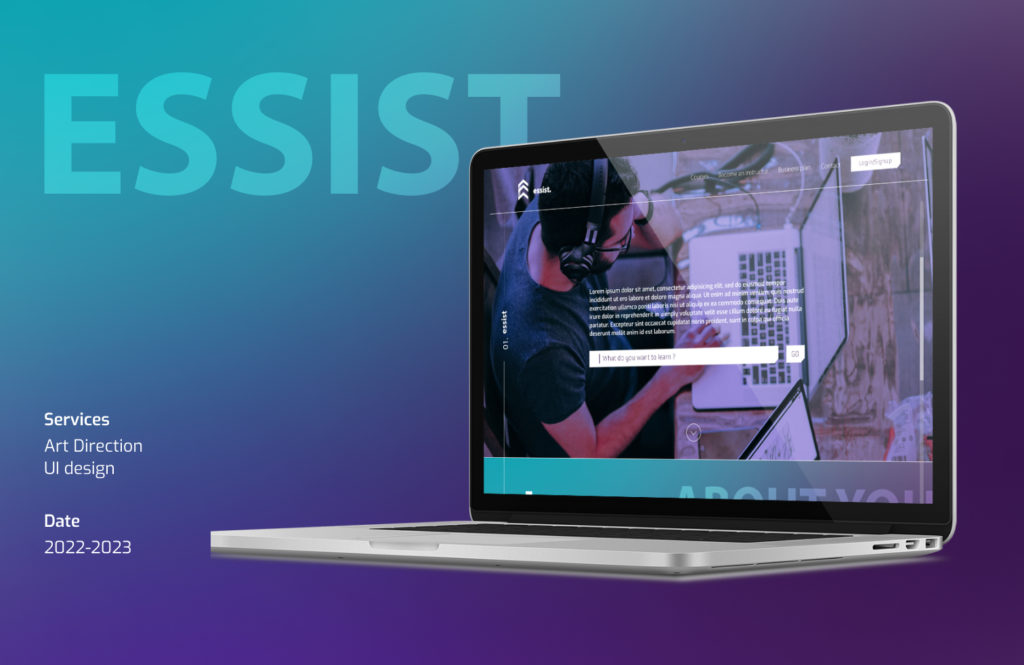
Essist
Project
Essist is a new kind of a online school that offers an innovative experience which merges education, guidance and in-house funding, into one place; generating a wealth of options so every individual can achieve what they once believed was unattainable.
Goal
The client approach me to take on the development of the identity through the website.
Goal
Year
2022-2023
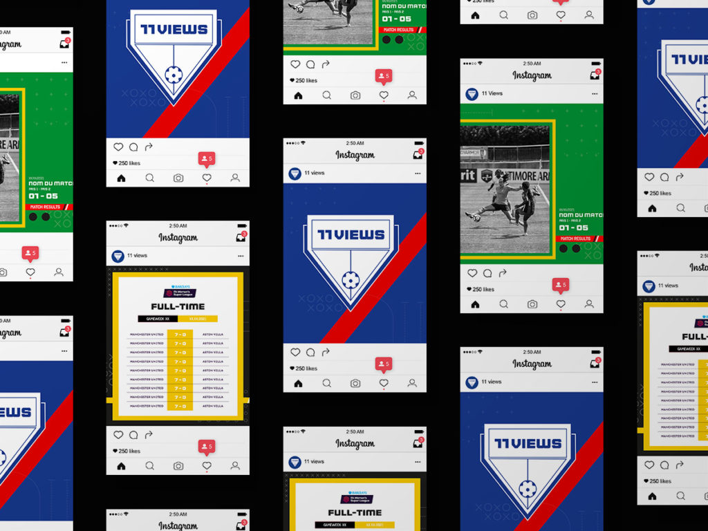
11 Views
Client
11 Views is a media specialized in women’s football. Created by two football enthusiasts, their ambition is to pay tribute to female players and make this discipline as popular a phenomenon as men’s.
Concept
The team, in the sense of a large sporting family which would bring together the players as well as the clubs, the media and also the fans. Because it is by creating a feeling of collective belonging that this discipline will be able to gain visibility and popularity.
Solution
Development of a graphic identity based around the concept. Providing a coat of arms and a visual system to the media allowing it to bring together both football clubs and their fans.
Year
2020
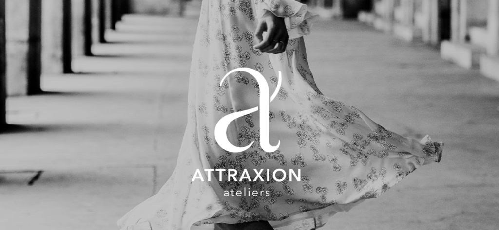
Attraxion Ateliers
Client
Attraxion Ateliers is a collaborative project between different schools (La Fabrique, ISIPCA, ESMODE and Ferrandie), in the form of a mini-company.
Context
Every year, students from La Fabrique school, in partnership with Gobelins and Ferrandi, form a micro-enterprise and launch a brand. It is for its need for graphic identity that the brand turned to the Gobelins. And it is to meet this need that a one-week workshop is launched.
Solution
To best meet the client’s needs, with my partner (Manon Wargnier), we have developed a conceptual artistic direction: “The experience of your senses”.
Why this concept? Because Attraxion is the feeling of attraction. It is a universe filled with discoveries and sensations where you experience in turn the thrill of an encounter, the adrenaline of seduction and the delight of attraction.
Year
2019
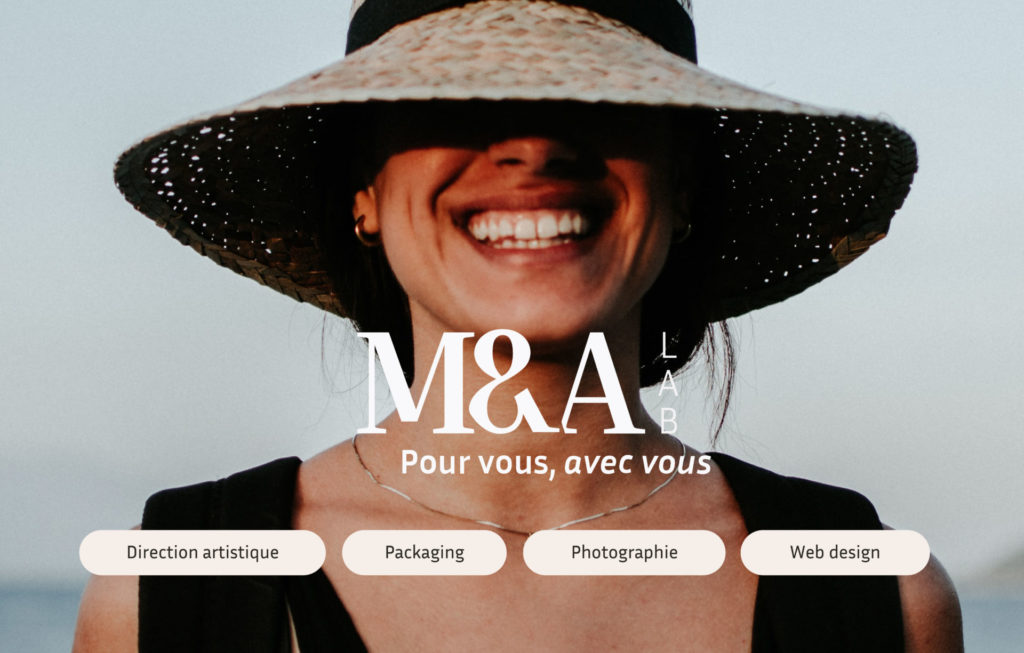
M&A Lab
Client
M&A Lab is a beauty and cosmetics brand with an “In & Out” concept, reflecting the art of individual beauty and working for overall well-being. A holistic approach where the individual regains confidence and self-esteem without compromising on the effectiveness and quality of their In & Out routines.
Context
The client approached me at the very beginning of their project. With absolutely everything to do: graphic identity, packaging, photography, website, social networks…
Solution
After an in-depth analysis of the brand’s needs (communication objectives, target, market, positioning, etc.) I developed an artistic direction around the concept « Pour vous, avec vous » (For you, with you). The design reflects the brand’s philosophy. Based on a simple, organic and refined language.
Year
2021-2022
HorusTest
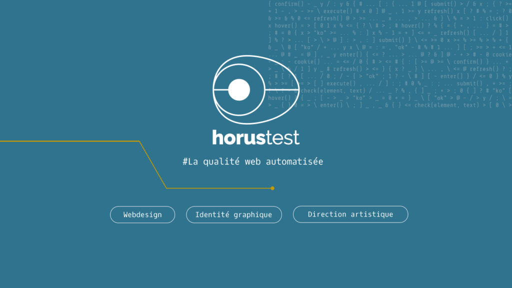
Client
Horus Test offers a tool to make the acceptance phase less restrictive and more efficient. Without development skills, it allows you to automate functional scenarios simply and quickly.
Context
The client approached me for a redesign of her graphic identity, with instructions to keep the logo as it is and the two main colors (blue and gold).
Solution
After a strategic study of the brand and its positioning, I chose to develop the new identity around the graphic axis of performance: “HorusTest is a Web quality solution that matches your performance.”
Year
2021
USA
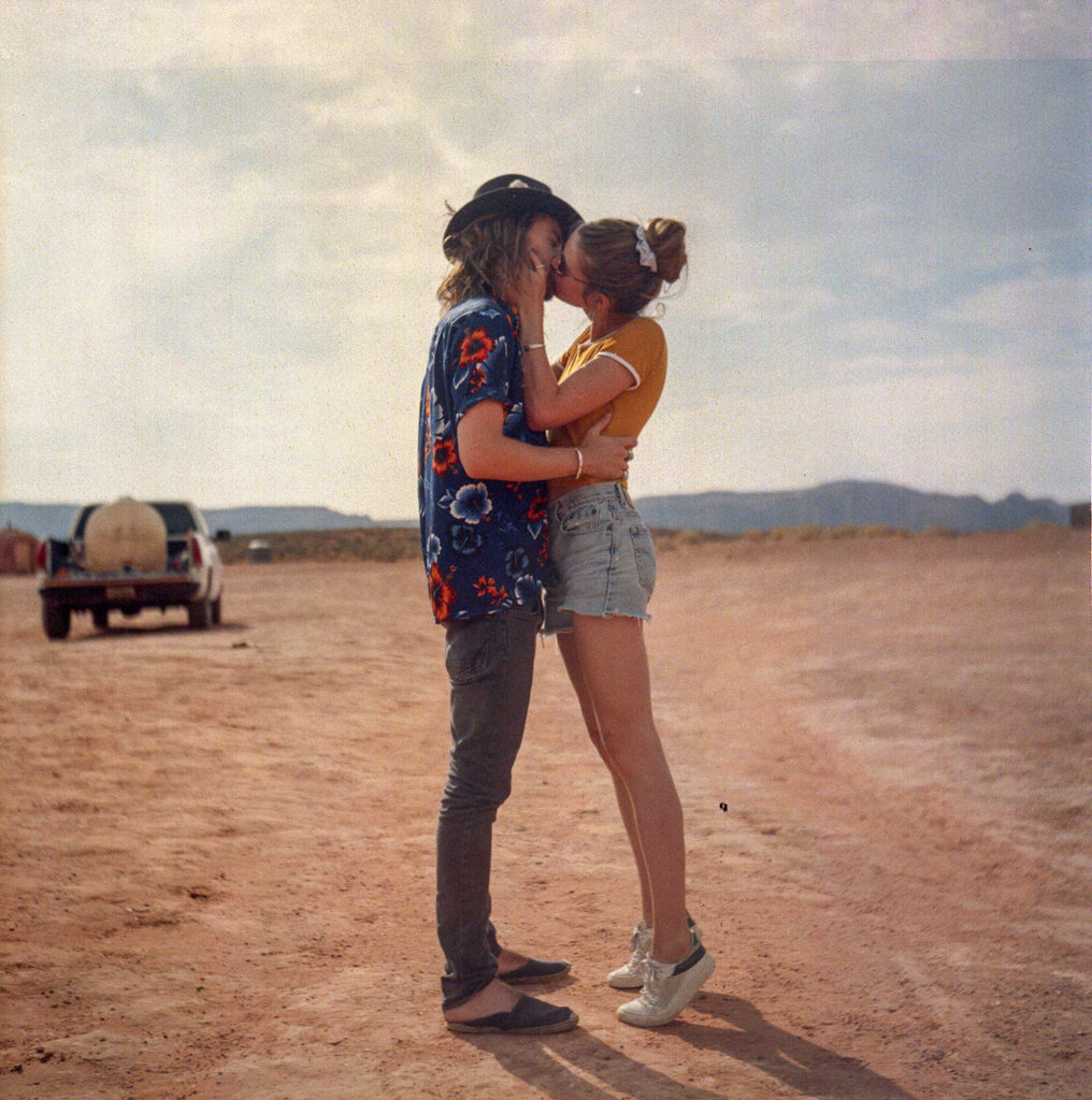
Project
After reading the book “On the Road” by Jack Kerouac, I wanted to recreate the road trip and see if the American society described in the book had evolved.
With a group of friends, we went to New York / San Francisco and lived on the road for a month and set off to discover the Americans.
This project documents the process and our approach.
Year
2018
Theodore
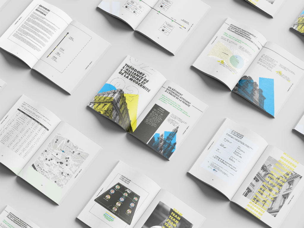
Client
Savills France is a company specializing in the real estate sector. It offers its services in several areas, whether consulting, investment, management, renovation, coworking or coliving. It covers all real estate professions
Context
For the Invest department, with the aim of winning a sales mandate for a Parisian building, I was asked to develop a graphic identity around this property.
Solution
The tenant of the building being a very well-known sports brand, I developed a concept around sport, to offer a complete graphic solution ranging from packaging to the book.
Year
2020
Solidarité Femmes
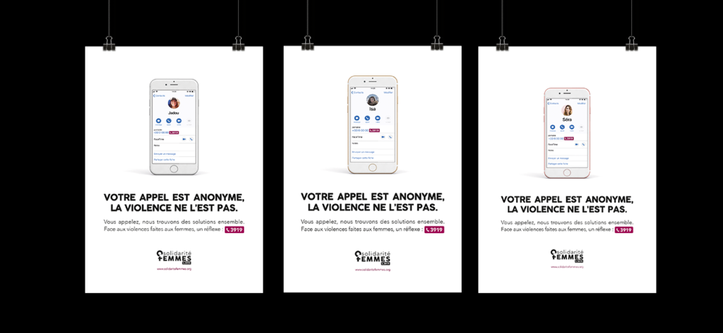
Client
The association against violence against women! A national hotline 3919 – Violences Femmes Infos is committed to supporting women for their rights to freedom, equality, integrity and supporting them in escaping violence. Instill in women, victims of violence, the power to act through a relationship of trust.
Context
Workshop as part of the CRG (Graphic Design and Production) training at the Ecole des Gobelins. In teams of three we had to propose a logo redesign and carry out an advertising campaign.
Solution
Year
2019
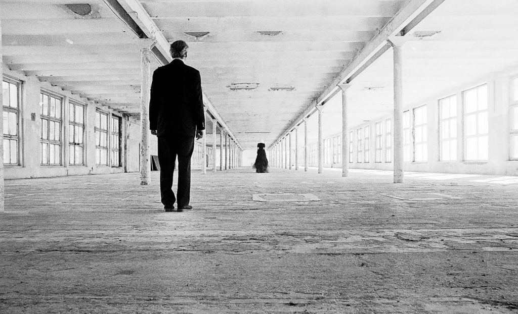
SEAMS
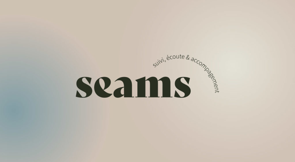
Client
Seams, a social service that listens to models.
This service aims at their professional and personal development. A model who knows and understands the environment in which he operates allows him to have an adapted professional posture and a healthy body. Seams also aims to create an ethical label for modeling agencies.
Context
Supermodel, Seams, thanks to its support and the support provided to both agencies and models, gives everyone the keys to achieve their potential and become the best they can become. Everyone can be a supermodel if psychology follows.
Solution
Development of a graphic identity based around the “Supermodel” concept. This is inspired by the fashion world, but also by well-being.
Year
2021
Riga
Project
This photographic series aims to show the paradoxes between the different generations living in Latvia and more particularly in Riga.
It all started in 2015 when I went to live for 6 months in Latvia as part of Erasmus. At that time, I was a student of economics and social sciences.
The experience totally exceeded my expectations. I discover a country in full awakening, fractured between two visions: part of the population still living the trauma caused by Soviet oppression and the other part, the young, those who have not experienced this free period, independent and dynamic.
Indeed, Latvia finally obtained its independence in 1991 (after having been occupied throughout history by the Swedes, the Germans, the Poles and the Russians). So the country has been free for 25 years. So, on the one hand, there are those over 35. They remember the Soviet regime. They only speak Latvian and Russian, or even only Russian, do not respect any rules of politeness (in fact, during the USSR, politeness was a sign of the bourgeoisie and therefore to be avoided) and are afraid of foreigners. On the other there are those under 30, those who don’t remember those times.
These young people travel all over the world, speak Latvian and English, reject any Russian roots. They are dynamic, open and very creative. And above all, today, it is they who are gradually arriving at the head of large companies, the government, organizations… They are waking up the country and it is an extraordinary thing to witness live to this awakening and its changes.
And that’s the goal of the series: to show these parallels that inhabit Latvia.
Year
2015-2018